Responsive web layouts are becoming more and more popular with the rise of the machines (don’t worry, i’m not talking about Arnold). The machine i’m referring to are the smartphones that 35% of the United States know and love. That may seem like a small number, but that estimates 112 million people over the age of 13 are iPhoning or Androiding their way to web content which is where responsive web layouts come into play.
Thanks to advances in web browsers and the frameworks that make the web beautiful (CSS/HTML/JAVASCRIPT) adapting to the range of smart-devices is now more attainable. Responsive web layout allows your web designer/developer to build on top of a fluid, CSS3 framework that adjusts with your device width. You can read more about it at A List Apart where they’ve gone into more detail.
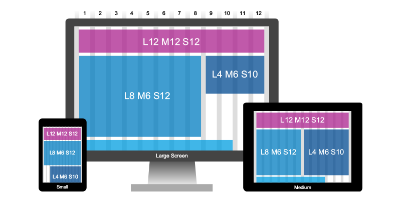
The best part about responsive web design is that it only impacts certain device widths and certain browsers that support CSS3 @media queries (essentially meaning iDevices & Android devices). If the browser you’re using doesn’t support them it will degrade gracefully and the desktop experience is what you’ll be presented. For an example of responsive in action, just resize your browser (Webkit, FF, Opera) window while reading this article or visit it on your smartphone. You’ll notice that content changes or disappears and you’re still able to read the text without pinch-zooming your way through it, pics below.
So why would does this all matter?
Smartphone usage is on the rise and with it smartphone email reading, yes that’s right, 16% of the email reading world is using an iDevice to read their email. If you’re a marketer and you send emails to prospects or clients you likely have a call to action that points back to your site. Imagine the joy of your end user when they visit your responsive landing page and fill out a form that is touch friendly without the need to pinch and squint. Your website is the end point for nearly every campaign you’ll run so spending time building or re-building your site to ensure your content reaches the intended target is worth it (IMO). You spend time as a marketer carefully crafting campaigns that fill the needs of your prospective customers so spending time understanding how they’re digesting your materials is equally good practice.
Back to article list