Emails have been on my mind lately, specifically the layout.
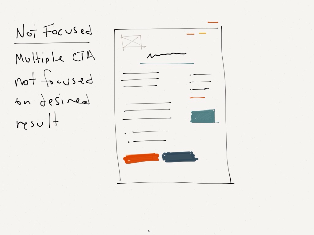
Personally I’ve tested hundreds of layouts along w/ subject lines and creative and still find one thing to ring true regardless of the offer: keep it focused

It’s in our nature to confuse things and regurgitate all we know onto our prospects and customers, but this doesn’t help our collective CTR’s or conversion.
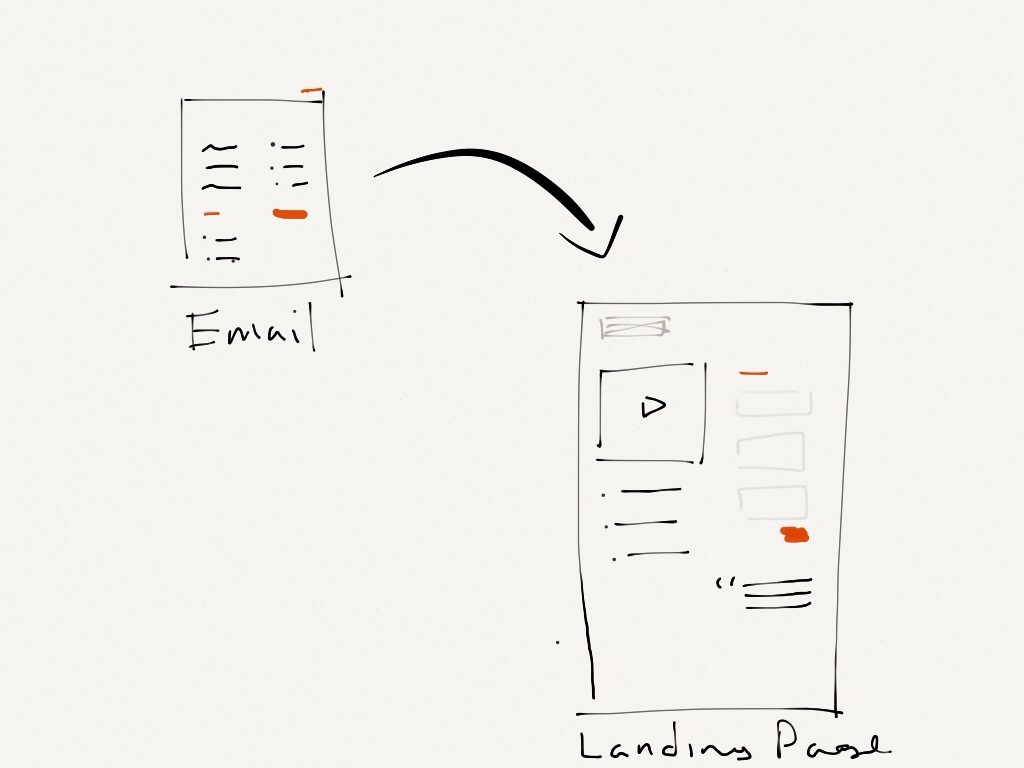
The email copy and creative should provide an easy, scannable layout that prompts the desired action.

Also, keep that focus going through to the landing page and reduce the thinking involved for the prospect. Keep your action words, colors and design consistent from email open to form submission.